
Data Analyst vs Data Scientist - A Career Comparison
- gavlestrangebusine
- Mar 18, 2024
- 8 min read

Updated: Jan 16, 2025
Skills Used: Python - Pandas, Pandasql, SQL, Seaborn, Matplotlib, Numpy - Excel
Full Project On GitHub: https://bit.ly/3J5Et4W
About The Data:
Data source for this project is public on Kaggle and can be found at
Last updated January 2024
The data source contains 9355 rows with 12 columns describing various data job roles. For this project, we've specifically focused on entries containing the job title "Data Analyst"or "Data Scientist".
By analyzing the experience requirements, salary ranges, work setting, employment type and other job related factors for these two titles, we aim to provide valuable insights for students considering a career path in data analysis or data science
Question:
Analyze the dataset to provide insights to students considering a career path as a data analyst or data scientist. Which role provides better pay for lower experience level positions, which job allows remote work on a more regular basis. Delve deeper to give a more in-depth look at the roles.
Python Project:
Using Python on Jupyter Notebook to transform the dataset and provide insights.
For this project we'll be using the pandas and pandasql libraries to store the dataset and to perform queries for visually. Visuals will be created using matplotlib and seaborn.
# Import Required Python Packages
import pandas as pd
import pandasql as pq # will do sql queries on python
import numpy as np
import matplotlib.pyplot as plt
import seaborn as sns

# Set the style using seaborn
sns.set(style = 'ticks', palette = ['#47b0aa','#e57872'], rc = {'axes.facecolor':'#e0e0e0'})
We have to import the dataset using pandas. Checking the dataset for Null values or missing values that will cause issues with any insights.
# importing the dataset (jobs in data)
jobs = pd.read_csv('D:\Learning\Portfolio\Jobs & Salaries Data\\jobs_in_data.csv')

# Displaying the first few rows of the dataset for an initial overview
jobs.head()
Checking for Null values in the dataset and getting an overview of the columns and data types.
# In depth Look at the dataframe
# checking for any Null values or missing data
jobs.info()
Full overview of the dataset.
jobs.describe(include = 'all')
DATA TRANSFORMATION
Transforming the dataset to only include values needed to answer the question (data analyst vs data scientist).
Firstly inspect the count of the job roles per country and the weight of these values on the total sum to determine which data scientist and data analyst data can be used.
Calculating the count for each country and the weight of the country on the total transformed data (only data analysts and data scientist )
# Calculating the count of each Location
# Calculating the weight on the total data
jobs_count = pd.DataFrame(jobs[['company_location','employee_residence', 'job_title']].value_counts())
jobs_count['dataset_total_%'] = round((jobs_count['count']/jobs_count.values.sum())*100,2)

# Searching only for Data Analyst and Data Scientist
req1 = 'Data Analyst'
req2= 'Data Scientist'

# Changing Settings to display all rows
pd.set_option('display.max_rows',73)

jobs_count.reset_index().query('job_title== @req1 or job_title == @req2').sort_values(by=['count', 'dataset_total_%'],ascending =[False, False])
Calculating the count for each country and the weight of that country has on the specific job role ( data analysts and data scientist)
# Calculating the count of each Location and the weight on the total data for Data Scientist and Data Analyst

filtered_jobs = jobs.query('job_title == @req1 or job_title == @req2')[['company_location', 'employee_residence', 'job_title']]

jobs_count = filtered_jobs.value_counts().to_frame(name = 'count')
jobs_count['dataset_total_%'] = round((jobs_count['count']/jobs_count.values.sum())*100,2)

pd.set_option('display.max_rows',73)

jobs_count.reset_index().sort_values(by=['count', 'dataset_total_%'],ascending =[False, False])
Transforming the data to include 96% of the transformed dataset (includes only data analyst and data scientist job title) Transforming the data to have a pair for each job title per country. This will include USA, United Kingdom, Canada and Spain only.
# Creating job_sorted that will contain Data Scientist and Data Analyst from USA, United Kingdom, Canada and Spain
# This will include 96% of the data and will provide quality insights
job_sorted = jobs.copy()

job_sorted = job_sorted.query("job_title in ['Data Scientist', 'Data Analyst'] and company_location in ['United States', 'United Kingdom', 'Canada', 'Spain']")

job_sorted.head()
# Dropping rows with contract and freelance
# Not enough data for each to find insights (Only 1 of each)
job_sorted = job_sorted.query("employment_type != 'Contract' and employment_type != 'Freelance'")
Cleaning the transformed dataset, by removing repetitive columns and updating the column names work year to year and salary in usd to salary.
# Remove repitive columns and company_size
job_sorted.drop(columns = {'company_size','salary_currency','salary'}, inplace = True)


# Update column names work_year and salary_in_usd
job_sorted.rename(columns = {'work_year': 'year', 'salary_in_usd': 'salary'}, inplace = True)

job_sorted.head()
ANALYZING DATA
Analyze the job_sorted dataset to find insights for students to use in choosing their career paths.
Using Pandasql to perfom queries to be displayed by seaborn and matplotlib.
Creating a bar graph showing the count of employees compared to experience level for both data scientist and data analyst.
# Using Pandasql to create a query
# Compare experience levels for Data Analyst vs Data Scientist
query = """select job_title, experience_level, count(experience_level) as total
from job_sorted
group by job_title , experience_level"""

exp_level = pq.sqldf(query, locals())
print(exp_level)
# Plot a bargraph using seaborn and matplotlib
# Comparing Experience Level using exp_level

# Creating barplot using seaborn
ax=sns.barplot(
    x="experience_level",
    y="total",
    hue="job_title",
    palette = ['#47b0aa','#e57872'],
    data=exp_level
    )
ax.set_facecolor("#e0e0e0")

# Add labels and Titles using matplotlib
plt.xlabel("Experience Level")
plt.ylabel("Total")
plt.title("Employee Compared To Experience Level")
plt.legend(title="Job Title")

# Show plot
plt.show()
The bar graph reveals a concentration of employees at the senior level, followed by mid-level. This shows a potential gap in entry-level positions, which could present opportunities for recent graduates.
An intriguing finding is the significantly higher number of senior data scientists compared to data analysts. This disparity could indicated a greater frequency of promotions within the data science route, or it might suggest data analysts transitioning to data science roles later in their careers. Further investigation into would be necessary to confirm hypothesis

Creating a bar graph comparing employment type (Full or Part time) to the count of employees for each job title.
# Query comparing employment type to Job title
# Full time or Part time
query1 = """select job_title, employment_type, count(employment_type) as total
from job_sorted
group by job_title , employment_type"""


employ_total = pq.sqldf(query1, locals())
print(employ_total)
# Comparing Employment type to Employee Count
# Creating barplot using seaborn
bx=sns.barplot(
    x="employment_type",
    y="total",
    hue="job_title",
    palette = ['#47b0aa','#e57872'],
    data=employ_total
    )
bx.set_facecolor("#e0e0e0")

# Add labels and Titles using matplotlib
sns.set_style('ticks')
plt.xlabel("Employment Type")
plt.ylabel("Total")
plt.title("Employee Count Compared To Employment Type")
plt.legend(title="Job Title")

# Show plot
plt.show()
The bar graph overwhelmingly indicates a full time work environment for both data scientists and data analysts. This finding provides valuable context for students entering these fields. They can expect full time positions are the dominant employment model, which they should plan accordingly.

Creating a bar graph comparing the work setting (Hybrid, in person, remote) to count of employees for the job roles.
# Query comparing work setting to Job title
# Hybrid, Remote, In-Person
query2 = """select Job_title, work_setting , count(work_setting) as total
from job_sorted
group by job_title, work_setting"""

work_total = pq.sqldf(query2 , locals())
print(work_total)
# Comparing Work Setting to Employee Count
# Creating barplot using seaborn
cx=sns.barplot(
    x="work_setting",
    y="total",
    hue="job_title",
    palette = ['#47b0aa','#e57872'],
    data=work_total
    )
cx.set_facecolor("#e0e0e0")

# Add labels and Titles using matplotlib
sns.set_style('ticks')
plt.xlabel("work Setting")
plt.ylabel("Total")
plt.title("Employee Count Compared To Work Setting")
plt.legend(title="Job Title")

# Show plot
plt.show()
The bar graph shows a distribution between in person and remote work, with minimal positions categorized as hybrid. This emphasis on remote work options signifies a potent shift towards flexible work models within data professions. This could be driven by companies seeking to attract top talent from a wider geographical pool and potentially offering greater work life balance for employees. This finding presents promising opportunities for students seeking remote careers in data analysis or data science.

To gain comprehensive understanding of salary for data analysts and data scientists, I conducted 3 queries.
The first query looks into salary for both job titles, average, maximum and minimum.
Data Scientists on average earn almost $50 000 more than data analysts. The max salary for data analysts exceeds that of data scientists, potentially pointing out a outlier and further analysis is needed.
The second query delves deeper by analyzing salaries within each employment type (full time or part time).
The insights on the second query are limited as part time workers only consists of 5 employees across the two job titles, drawing significant conclusions will be unreliable. Full time employees are paid significantly more than part time employees, which is expected.
The third query examines salary variations based on experience level within each employment type and job title.
The analysis revealed that entry level data scientists earn significantly higher average salary (almost $20 000 more) than entry level data analysts. This suggests potentially steeper initial earning potential in the data science career path but an increase in education is needed.
However a interesting finding shows mid level data scientists exceed the average salary of senior data analysts. While this could indicate faster salary growth in data science due to higher complexity of the role, its important to acknowledge that this pattern might be due to limitations to the sample size of the data.
# Compare average, Minimum and Maximum Salary for Data Analysts and Data Scientists
query2 = """select job_title, round(avg(salary),2) as avg_salary, min(salary) as min_salary, max(salary) as max_salary
from job_sorted
group by job_title"""

job_salary = pq.sqldf(query2 , locals())
job_salary
# Compare Employment type to Avg Salary for each Job Title
query3 = """select job_title, employment_type, round(avg(salary),2) as avg_salary, count(employment_type) as count
from job_sorted
group by job_title, employment_type"""

empoly_salary = pq.sqldf(query3 , locals())
empoly_salary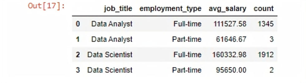
# Compare Employment Type to Experience Level for Average Salary against both Job Titles
query4 = """Select job_title, employment_type, experience_level, round(avg(salary),2) as avg_salary
from job_sorted
group by job_title, employment_type, experience_level"""

sal_table = pq.sqldf(query4, locals())
sal_table
Create a box and whisker plot to compare data analysts vs data scientists, in work setting and experience level compared to salary. Using the queries above.
# Create a Box and Whisker plot for Experience Level and work setting For each Job Title
plt.figure(figsize = (15,5))

# Design and Plotting first box and whisker
plt.subplot(121)
sns.boxplot(data = job_sorted, x= 'experience_level', y = 'salary', hue = 'job_title')
plt.xlabel('Experience Level')
plt.ylabel('Salary')

# Design and plotting second box and whisker
plt.subplot(122)
sns.boxplot(data = job_sorted, x= 'work_setting', y = 'salary', hue = 'job_title')
plt.xlabel('Work Setting')
plt.ylabel('Salary')

# Show Plot
plt.show()
A box and whisker plot was created to visually compare the salary distribution of data analysts and data scientists. From the plots we can gauge that data analysts have 3 major outliers in the upper quartile, that could skew the insights. From the plot we can determine that data scientists have a much higher ceiling for potential salaries than data analysts.
# Creating a Box and Whisker plot for salaries for both Data Analyst and Data Scientist
plt.figure(figsize = (5,5))

# Design and plotting
sns.boxplot(data = job_sorted, x = 'job_title', y ='salary', hue = 'job_title')
plt.xlabel('Job Title')
plt.ylabel('Salary')

# Show Plot
plt.show()
Conclusion:
This project delved in a data job dataset from kaggle, to equip students and people exploring a change in career path with valuable insights into career paths in data analysts vs data scientists.
Key findings:
· Salary: Our analysis revealed that entry-level data scientists offer a steeper initial earning potential, with an average salary nearly $20,000 higher than entry-level data analysts. However, it's important to consider the potential need for additional education in data science compared to data analysis.
·Remote Work: Remote work opportunities appear more prevalent in both data fields, potentially driven by companies seeking top talent from a wider geographical pool and offering greater work-life balance.
· Career Progression: The significantly higher number of senior data scientists compared to data analysts suggests either a greater frequency of promotions within the data science track or data analysts transitioning to these roles later in their careers. Further investigation into career paths would be valuable.
Dataset Considerations:
· Outliers: The presence of outliers in the data analyst salary data and the unexpected pattern observed in mid-level vs. senior data scientist salaries highlight the potential limitations of sample size.
·Limited Part-Time Data: Due to the small sample size of part-time employees, drawing conclusive insights will be unreliable.
Overall, this project provided a compelling starting point for understanding the data analyst and data scientist career paths. By addressing data limitations and expanding the geographical scope and the scope of investigation, future analysis can offer even more conclusive insights to help students in their career paths.
This was a great opening project in python reports on data driven analysis. Improvements are needed in more in depth analysis, such as looking for correlation in the data. But I have gained a great understanding of pandas, Seaborn and Matplotlib from this project.
Full Project On GitHub: https://bit.ly/3J5Et4W


Comments